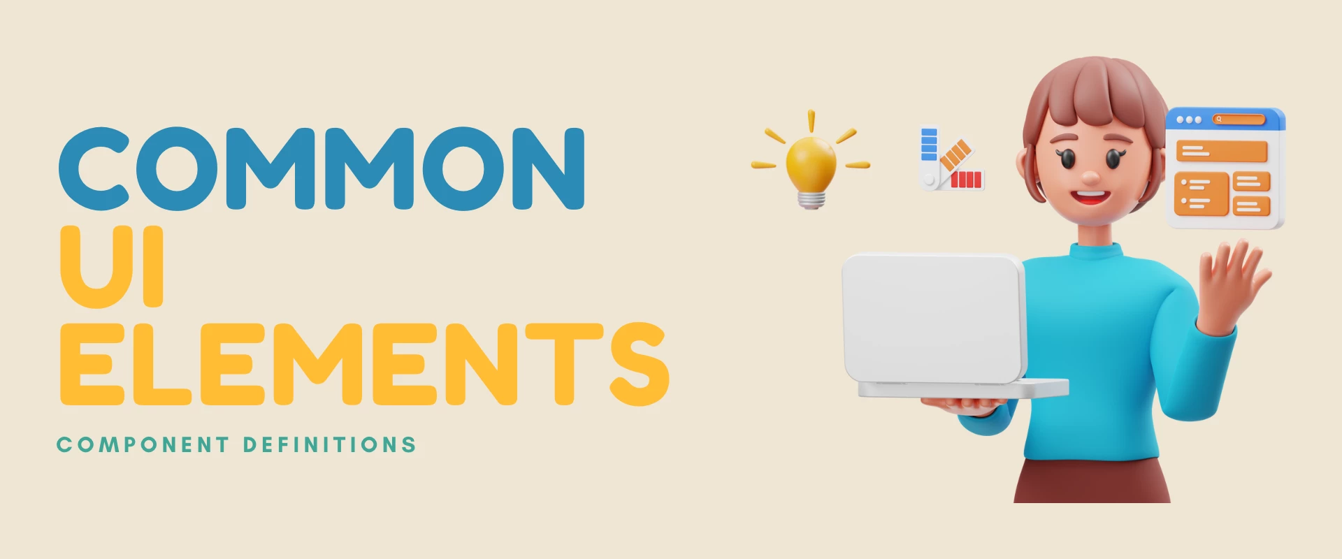
Common UI Component Definitions


Typically these UI components are: buttons, input fields, text forms, forms, cards, modals, menus, headers and footers. Gaining a good understanding of these components, their functionality, and how they can be integrated into your designs will eventually lead to a positive user experience on your site.
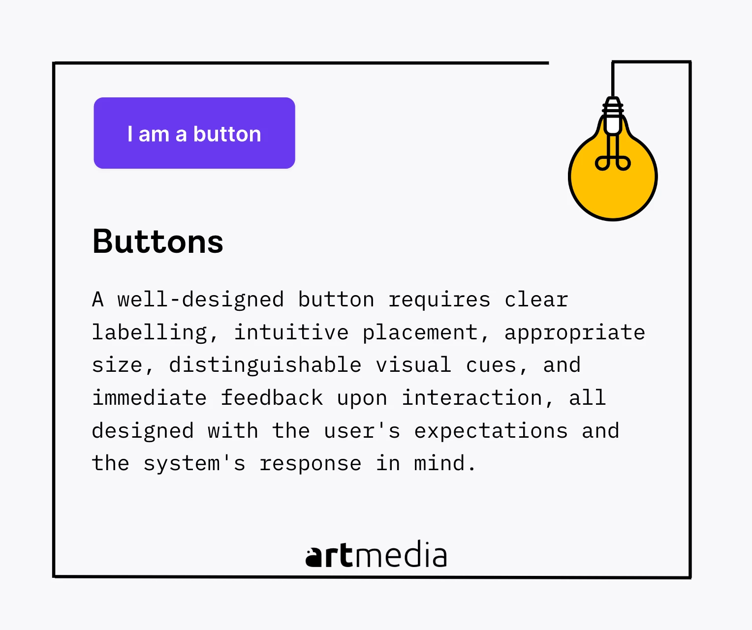
Button
Buttons were invented in 1973 as part of Xerox Star user interface and have revolutionized the way we interact with digital systems. They are graphic icons that allow users to interact with the interface and initiate actions or make selections. The role of a button in UX/UI design is pivotal as it serves as a call to action and guides users through an application or webpage. To ensure a user-friendly experience, buttons should be clearly recognizable, have consistent appearance, feedback, and appropriately labeled actions. A well-designed button reduces cognitive load and enhances user satisfaction and engagement with the design.
To make a better button, it requires clear labeling, intuitive placement, appropriate size, distinguishable visual cues, and immediate feedback upon interaction, all designed with the user's expectations and the system's response in mind.
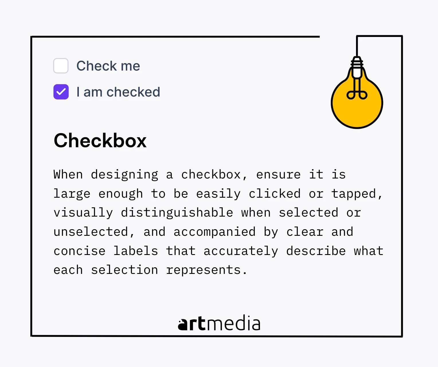
Checkbox
A checkbox is a user interface element that enables users to select one or multiple options from a set. It mimics the real-life action of ticking options in a physical list, bridging the gap between digital and physical interfaces. Checkboxes are commonly used in forms or settings to allow users to make multiple selections or indicate preferences. They enhance user interaction and satisfaction by providing flexibility and customization. Checkboxes have been an enduring and valuable element in user interface design due to their simplicity and intuitiveness.
When designing a checkbox, ensure it is large enough to be easily clicked or tapped, visually distinguishable when selected or unselected, and accompanied by clear and concise labels that accurately describe what each selection represents.
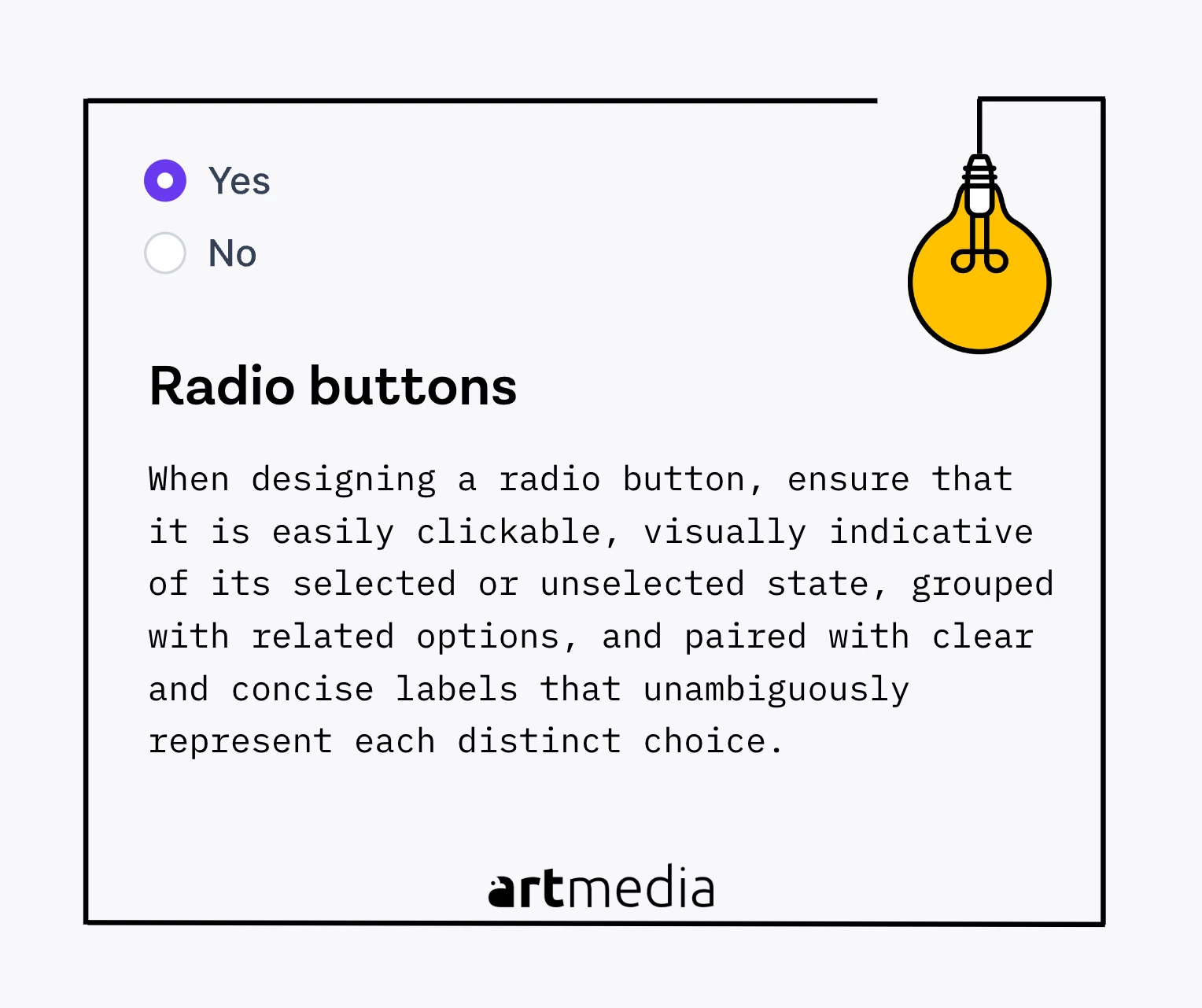
Raddio Button
When designing a radio button, it's important to ensure that it is easily clickable, visually indicative of its selected or unselected state, grouped with related options, and paired with clear and concise labels that unambiguously represent each distinct choice.
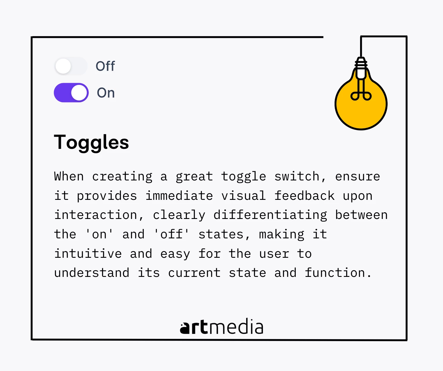
Toggle Switch
When creating a great toggle switch, ensure it provides immediate visual feedback upon interaction, clearly differentiating between the 'on' and 'off' states, making it intuitive and easy for the user to understand its current state and function.
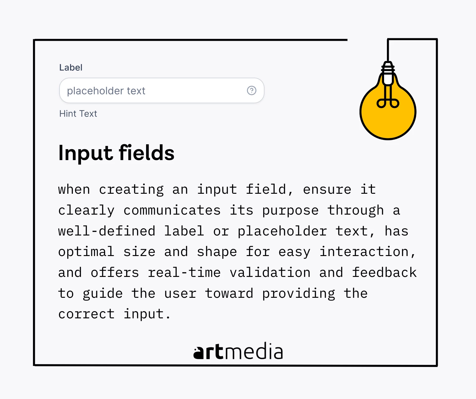
Input Fields
An input field, also known as a text field or text box, is a fundamental component of UX/UI design that allows users to enter information into a system. It has been a basic method for user input since the early days of computer interfaces. In UX/UI design, an input field serves as the point of interaction where users provide data to the system, such as filling out a form, entering a search query, or typing a message. Input fields are versatile and can accept various input types, including text, numbers, email addresses, and more, depending on the system's requirements. An example of an input field is the search box on a website like Google, facilitating user interaction, information retrieval, and overall user experience.
when creating an input field, ensure it clearly communicates its purpose through a well-defined label or placeholder text, has optimal size and shape for easy interaction, and offers real-time validation and feedback to guide the user toward providing the correct input.
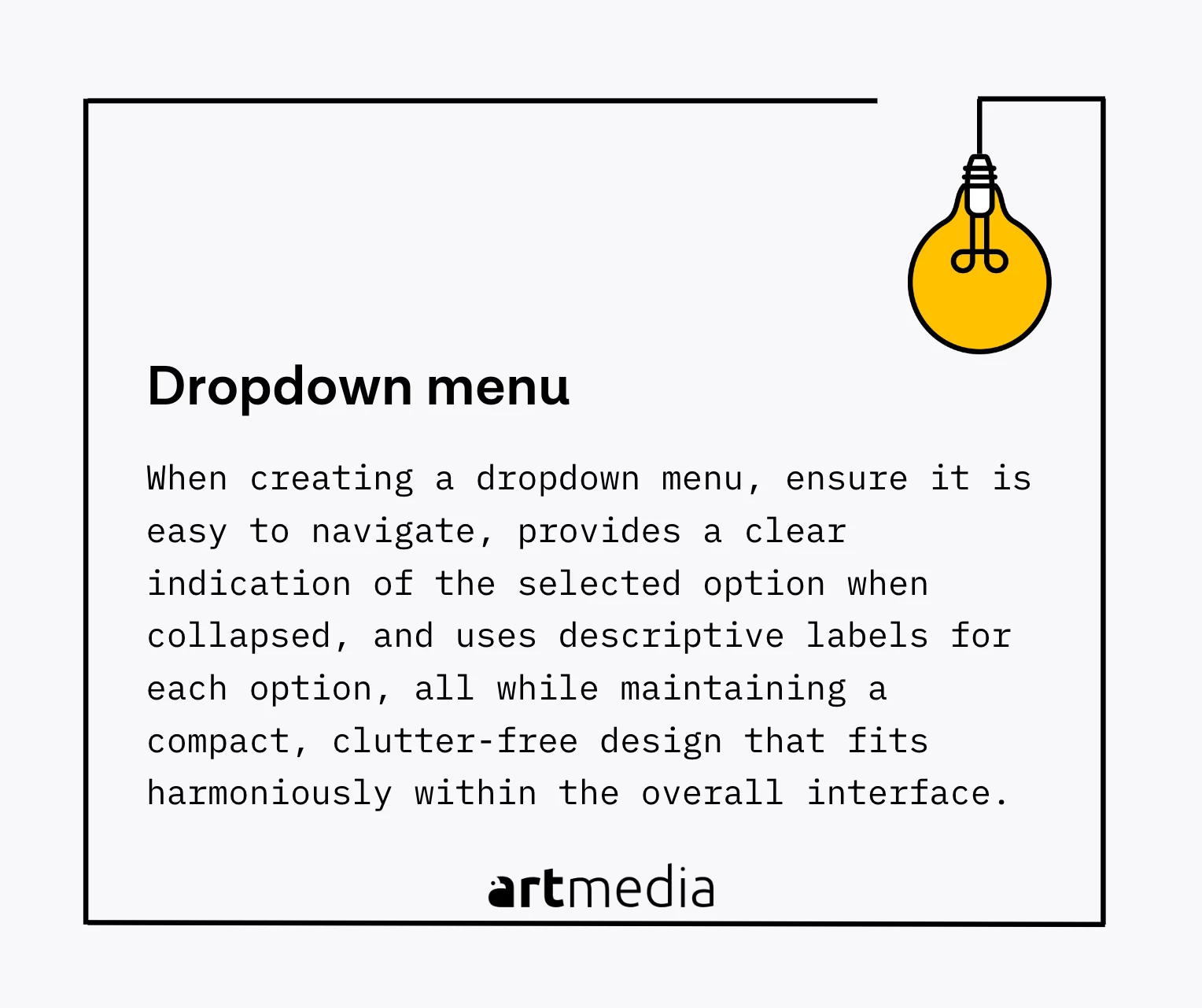
Dropdowns
A dropdown menu, also known as a dropdown list, is a graphical control element in UI design that allows users to choose a single value from a pre-defined list. It originated in the early 1980s with the development of Graphical User Interfaces (GUIs), providing a compact and intuitive way for users to navigate through multiple options without cluttering the interface. In UX/UI design, the dropdown menu serves as a space-saving component that simplifies complex selection processes by presenting multiple options in a structured manner while keeping the interface clean and uncluttered. An example of a dropdown menu in action can be seen on travel booking websites, where users select their country of origin or destination from a potentially extensive list. The dropdown menu elegantly solves this problem, offering a compact, scrollable list that the user can navigate with ease, with the chosen option displayed in the collapsed menu for clear visual confirmation.
When creating a dropdown menu from scratch, a UI designer should ensure it is easy to navigate, provides a clear indication of the selected option when collapsed, and uses descriptive labels for each option, all while maintaining a compact, clutter-free design that fits harmoniously within the overall interface.
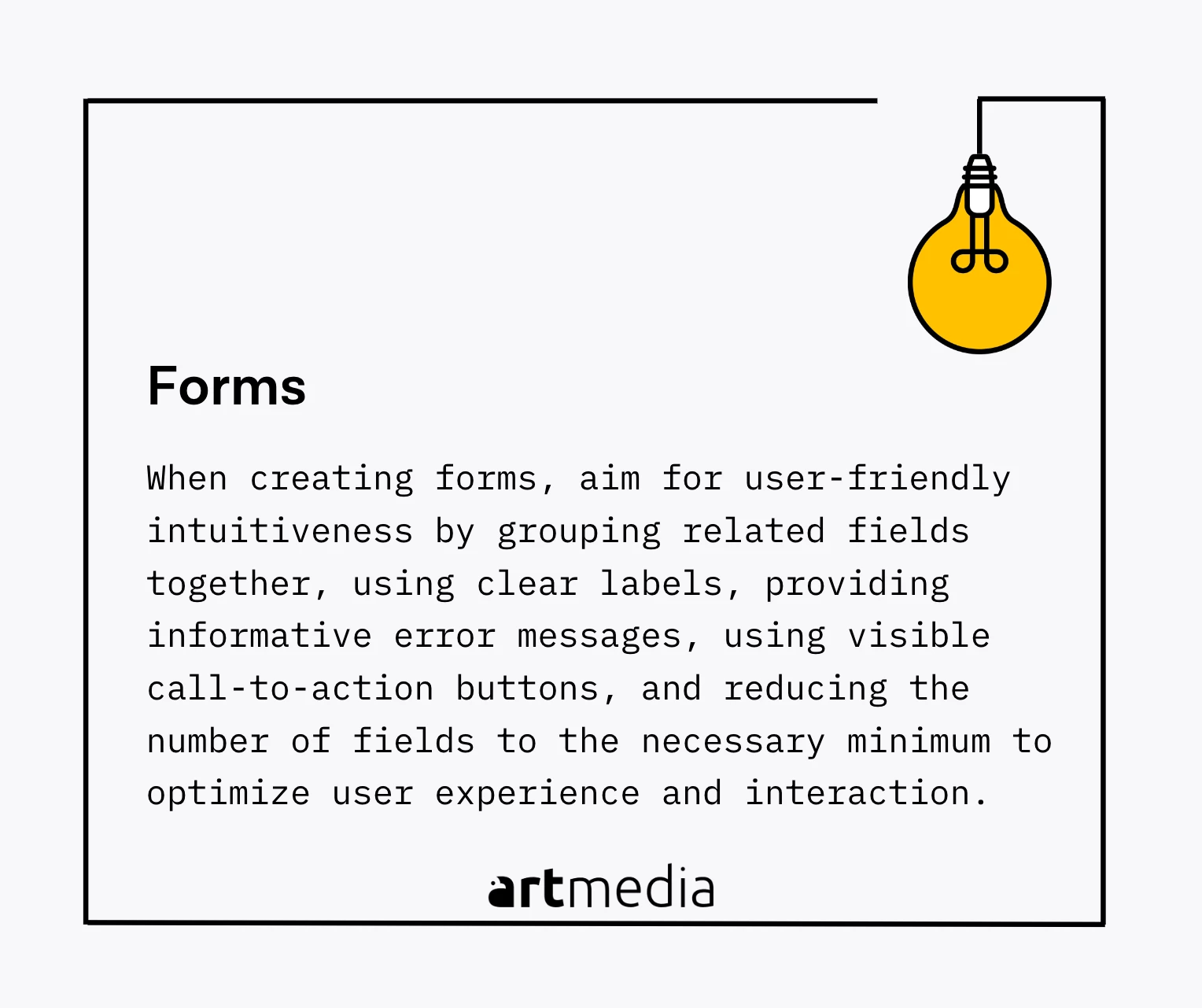
Forms
In UI design, a form is a group of related input fields where users can enter and submit information. Forms find their origins in physical paper forms used for data collection and have been integrated into digital interfaces as a way to collect and process user-provided data. A form typically consists of various input fields like text fields, checkboxes, radio buttons, dropdown lists, and a button to submit the form, accompanied by labels to indicate what information should be entered. Forms are vital in user interaction, enabling tasks like user registration, profile updates, online purchases, and more. An example of a form is the sign-up page on most websites, where users provide their name, email address, preferred password, and may also select user type and accept terms and conditions. Forms play a significant role in user interaction and the overall user experience by effectively collecting and processing user data.
When creating forms, you should aim for user-friendly intuitiveness by grouping related fields together, using clear labels, providing informative error messages, using visible call-to-action buttons, and reducing the number of fields to the necessary minimum to optimize user experience and interaction.
Modals
When creating modals, ensure they are concise and focused, delivering clear messages, providing straightforward interaction options, and allowing easy dismissal, all while being visually distinct from the background content to guide user attention effectively.
Cards
In UI design, a card is a rectangular or square container for discrete chunks of information. Cards date back to the 1970s but were popularized with Material Design by Google in 2014. Cards present a summary of information or a preview of more detailed content and often include a combination of images, text, and buttons. Due to their modular nature, cards are highly flexible and can be used in various contexts and layouts. A well-designed card should be clean, concise, and visually appealing, such as a product card on an e-commerce site that includes a product image, name, description, specifications, price, and a 'Buy' or 'More Info' button. Card layouts are easy to read and understand, making navigation and comparison shopping simple for users.
Ensure it has a clear and concise layout, with a harmonious balance of imagery and text, clear call-to-action, and consistent styling that matches the overall design language, all while being intuitive and easy for the user to interact with.
Tables
In UI design, a table is a grid-based structure used to organize and display data in a structured format of rows and columns. Tables have been used for centuries in various forms, such as ledgers and spreadsheets, and were introduced in digital interfaces with early productivity software. Tables play an essential role in presenting complex data in an easily digestible manner, allowing users to compare, analyze, and understand information effectively, especially when dealing with multi-dimensional data. A well-made table should be clean, uncluttered, and intuitive, and a good example might be a financial application showing a user's transaction history, where columns for date, transaction type, amount, balance, etc., and rows for each transaction allow users to understand their financial history at a glance and navigate the data efficiently.
When creating a table, ensure it's clean and uncluttered with clear labels, intuitive sorting and filtering options, adequate spacing for readability, and a responsive design that adapts well to various screen sizes, facilitating efficient navigation and comprehension of the data.
Header
In UI design, a header is the topmost section of a webpage or application interface that contains branding elements, navigation menus, and key information. Headers serve as a navigational guide and branding element, providing users with easy access to various sections and functionalities while incorporating branding elements like logos, taglines, or color schemes. A good example of a well-designed header is when it includes the site's logo, search bar, navigation menus, and additional links for login, subscriptions, or other relevant actions, providing clear navigation and reinforcing the brand's identity.
Keep the design of your header throughout the app or website.
Footer
In UI design, a footer is the bottom section of a webpage or application interface that contains additional information, navigation links, contact details, or copyright statements. Footers provide closure to the user experience, offering relevant information and additional navigation options, including links to important pages, secondary navigation menus, social media links, or subscription forms. A well-designed footer example can be seen on a business website, including the company's contact details, links to essential pages, and social media icons. Footers should include necessary links, copyright information, and legal disclaimers, and can also be an ideal place for supplementary navigation, quick links, a sitemap, or any additional information that complements the overall user experience.
Ensure it is consistently styled with the rest of the interface, includes relevant and easily accessible links, such as navigation menus or contact information, and consider incorporating visual elements or interactive features to engage users and encourage further exploration of the website or application.