Sharp Grotesk: The Versatile Typeface for Modern Design

Inspiration and Design
Sharp Grotesk was inspired by nineteenth-century wood type and Adrian Frutiger’s technical design process. The result is a typeface that is both bold and refined, with a unique personality that sets it apart from other sans-serif fonts.

The Family
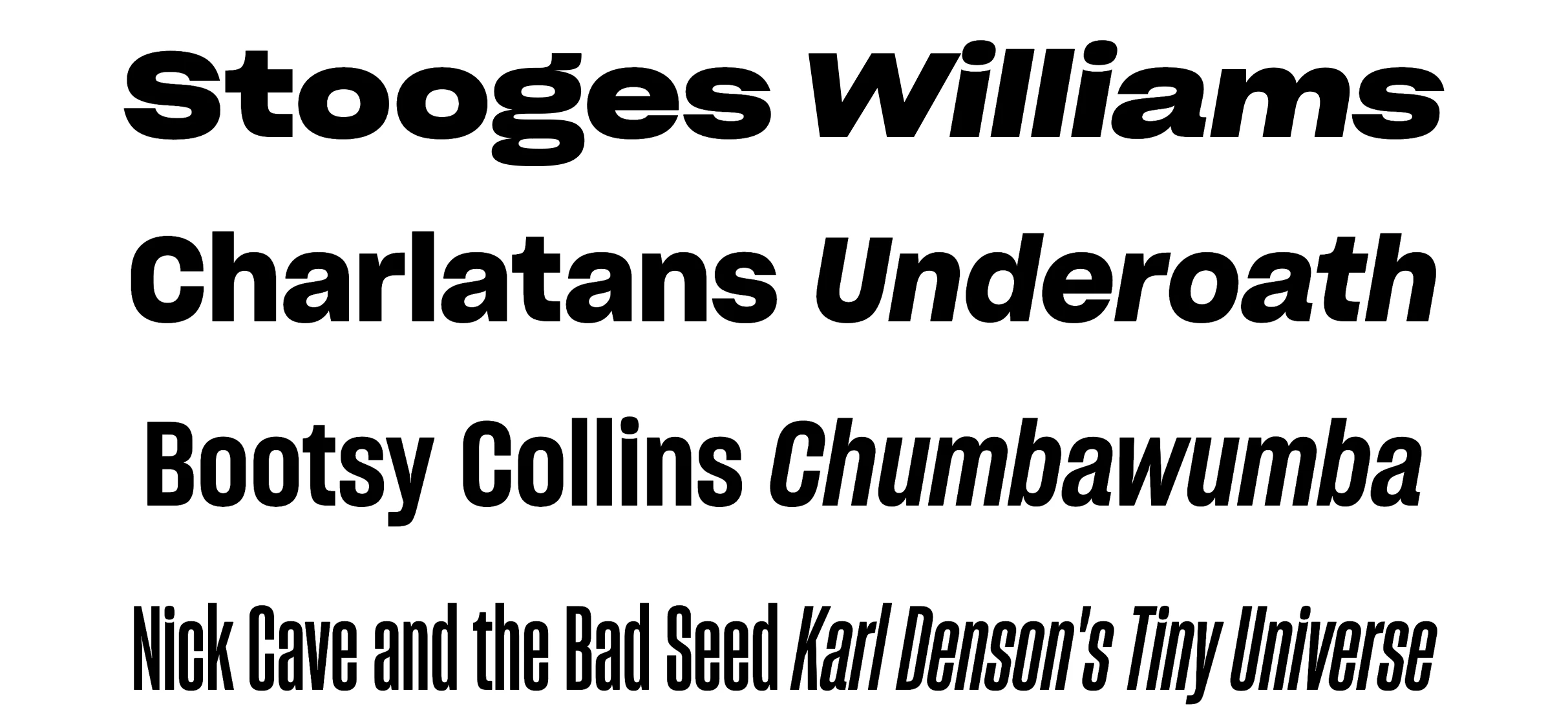
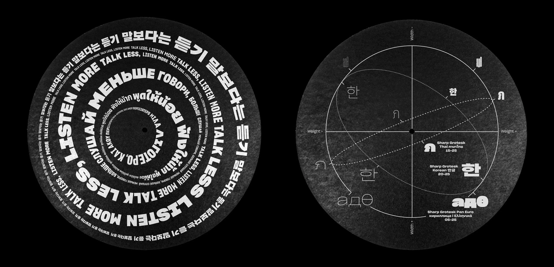
Sharp Grotesk is available in an impressive collection of 21 widths and seven weights, most with italics, for a total of 249 fonts. This makes it an incredibly versatile typeface that can be used for a wide range of design projects.

Use Cases
Sharp Grotesk is an excellent choice for modern design projects that require a bold and distinctive typeface. It is well-suited for use in branding, advertising, and editorial design.
One of the benefits of Sharp Grotesk is its versatility. With such a large collection of fonts, it can be used for a variety of design projects, from headlines and body text to logos and packaging.
Another advantage of Sharp Grotesk is its legibility. The clean lines and well-defined shapes make it easy to read, even at small sizes. This makes it an excellent choice for web design, where legibility is essential.

Variable Font
Sharp has plans to release the family as a variable font in the future. This will make it even easier to work with the huge variety of available styles on the web. Variable fonts are an exciting development in typography, allowing designers to create custom variations of a typeface on the fly.
The current price of the font family: $695.00. The package consists of the entire family set including all weights & widths in roman & italic.

Conclusion
In conclusion, Sharp Grotesk is a versatile and modern typeface that is well-suited for a wide range of design projects. Its unique personality and legibility make it an excellent choice for branding, advertising, and editorial design. With plans to release it as a variable font in the future, Sharp Grotesk is a typeface that is sure to remain relevant and popular for years to come.
